I was standing in a drafty palazzo near Ravenna last autumn, staring at a structural junction that felt more like a heavy-handed argument than a piece of architecture. I kept hearing people drone on about the “ethereal spirit” of mid-century design, as if gio ponti and lightness were some mystical, untouchable concept that exists only in glossy coffee table books. It’s infuriating. They talk about lightness as if it’s a decorative finish, like a thin coat of paint, when in reality, it is a violent struggle against gravity. You don’t achieve that kind of grace by accident; you achieve it through the precise, almost painful management of weight and connection.
I’m not here to sell you on the poetry of the void or some vague aesthetic dream. Instead, I want to show you the actual mechanics of how that weight is cheated. We are going to look past the polished surfaces and examine the structural intent—the way a joint is cut, the way a slab meets a column, and how a designer manages the tension between the solid and the empty. I’ll show you how to see the deliberate decisions that allow a building to breathe without falling down.
Table of Contents
Tracing the Intent Behind Italian Modernism Design Principles
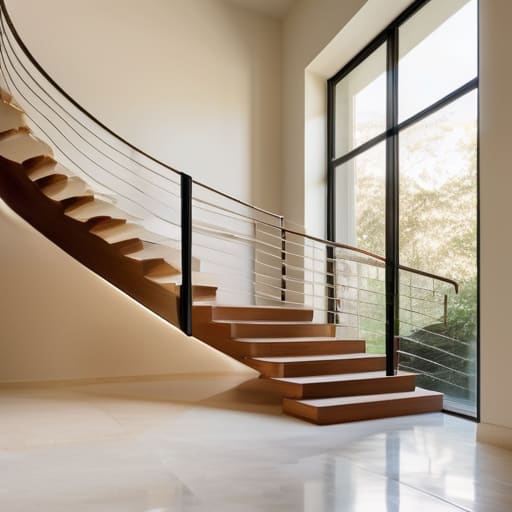
When I walk through a space designed under the influence of the mid-century era, I don’t look at the sweeping lines first; I look at the junctions. To understand Italian modernism design principles, you have to look at how a floor plane seems to surrender to a wall, or how a staircase doesn’t feel like a heavy stone intrusion, but rather a rhythmic sequence of steps. Ponti wasn’t interested in the brute force of concrete; he was obsessed with the illusion of buoyancy. He understood that spatial perception and lightness are not achieved by removing mass, but by directing the eye so it never settles on the heavy reality of the materials.
I often find myself tracing the edges of a built-in console or a slim partition, looking for that specific tension where the object meets the void. There is a certain discipline in his work—a refusal to let a structure feel anchored by gravity alone. Even when he moved into the realm of domestic objects, that same logic applied; you see it in the way a chair leg tapers, almost as if it is striving to escape the floor. It isn’t just about being “thin”; it is about a calculated, structural grace that makes the heavy feel ephemeral.
Where Spatial Perception and Lightness Meet the Eye
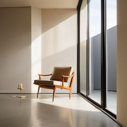
When I walk through a space designed by Ponti, I find myself looking less at the walls and more at the voids between them. It is a common mistake to think that lightness is merely a lack of mass; in reality, it is a highly disciplined management of what is not there. You see it in the way he manipulates the boundary between floor and wall, often using slender profiles that seem to dissolve the corner. This isn’t just an aesthetic trick; it is a fundamental part of spatial perception and lightness that forces the eye to travel upward and outward, rather than being pinned down by the gravity of heavy masonry.
I often find myself tracing the edges of his more delicate interventions, much like I would study the fine joinery of a Renaissance cabinet. There is a specific rhythm to his work—a way he balances the structural necessity of a support with a visual lightness that feels almost defiant. This sense of architectural weightlessness in design is never accidental. Whether he was designing a skyscraper or a single chair, he was obsessed with the idea that a structure should breathe. He understood that if you control the way light hits a surface or how a shadow falls across a joint, you can make even the most solid material feel as though it is barely touching the earth.
The Residue of Light
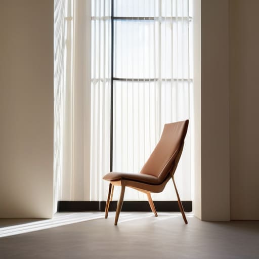
When we look back at Ponti’s work, we shouldn’t just admire the silhouette of a chair or the curve of a façade. We have to look at how he manipulated the structural tension between mass and void. He didn’t just design objects; he designed the air around them. By thinning the profiles and rethinking how a surface meets a shadow, he moved us away from the heavy, suffocating masonry of the past toward a modernism that breathes. It is in that delicate intersection—where a material seems to lose its inherent weight through deliberate geometric precision—that his true legacy resides.
I often find myself standing in a room long after the sun has set, tracing the way a corner is joined or how a light fixture casts its reach. It reminds me that architecture is never truly finished; it is a continuous conversation between the maker’s intent and the light that reveals it. Ponti taught us that lightness isn’t an absence of substance, but a mastery of presence. As you walk through the city tomorrow, don’t just look at the buildings. Look for the gaps, the shadows, and the way the light clings to a thin edge. That is where you will find the soul of the structure.