I was sitting in a small café in Milan last spring, staring at a piece of laminate that looked like it had been rejected from a fever dream, when it hit me how much we misunderstand the chaos of the eighties. Most critics treat memphis and postmodern colour as if it were merely a loud, accidental tantrum of aesthetics—a shallow explosion of neon and pastels thrown against a wall to see what sticks. They talk about it in terms of “vibrancy” or “irony,” but they completely ignore the intentionality behind the clash. To me, those jarring pigments aren’t just decoration; they are a deliberate structural rebellion against the beige, suffocating logic of modernism.
I am not here to give you a lecture on trend cycles or high-concept art theory. Instead, I want to look at these colors the way I look at a weathered travertine joint: by examining the logic of the decision. We are going to strip away the hype and look at how these pigments were actually applied to surfaces, how they interact with light, and why they refuse to sit quietly within a room. I’ll show you how to respect the grit and the geometry behind the glow.
Table of Contents
Shattering the Monochromatic Lie
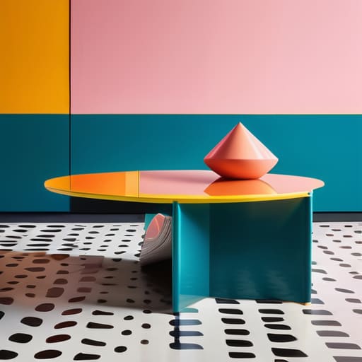
Before the Memphis Group arrived, the architectural world—and certainly the interior design world—was suffocating under a heavy, beige-tinted shroud of “good taste.” We were taught that color should serve the structure, a quiet servant to the lines of a room. But looking at those early Memphis pieces, you realize they weren’t just applying paint; they were staging a coup. They took the Ettore Sottsass color palette—those jarring, almost aggressive combinations of primary yellows and electric teals—and used them to strip away the pretense of structural hierarchy.
When I examine a piece from this era, I don’t just see a surface; I see a rejection of the idea that a building or an object must feel “settled.” Instead of the soothing, monochromatic gradients favored by the minimalists, we get these clashing, unapologetic bursts of energy. They utilized geometric patterns and bold hues to ensure that no single element could claim dominance. It’s a chaotic, wonderful way of working where the color itself becomes a structural component, as vital and as loud as the timber or the steel it sits upon. It forces you to stop looking at the silhouette and start looking at the tension between the pigments.
The Audacity of Vibrant Postmodernism Design
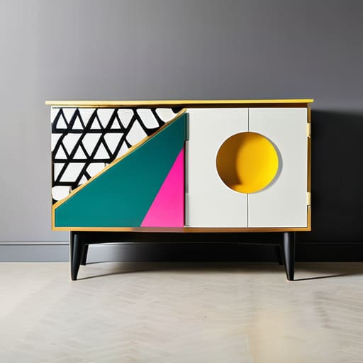
When I look at a piece of Memphis furniture, I don’t see a mere object; I see a violent rejection of the “form follows function” dogma that has governed our discipline for centuries. It is a deliberate, almost aggressive, use of vibrant postmodernism design to disrupt the viewer’s equilibrium. Where a classical architect seeks a seamless transition between material and space, the Memphis group—led by the restless vision of Ettore Sottsass—demanded a collision. They weren’t interested in the quiet dignity of a stone block; they wanted the cacophony of a carnival.
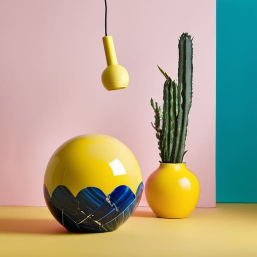
This wasn’t just about being loud; it was about the structural logic of the unexpected. By utilizing geometric patterns and bold hues, they stripped away the pretension of “good taste.” You see it in the way a primary yellow cylinder refuses to harmonize with a teal laminate surface. It’s a calculated instability. In my work with restoration, I spend my days trying to find the original intent behind a joint or a seam, but with Memphis, the intent is the disruption itself. They used color not to decorate a shape, but to weaponize it, turning every surface into a site of visual debate.
Beyond the Surface Tension
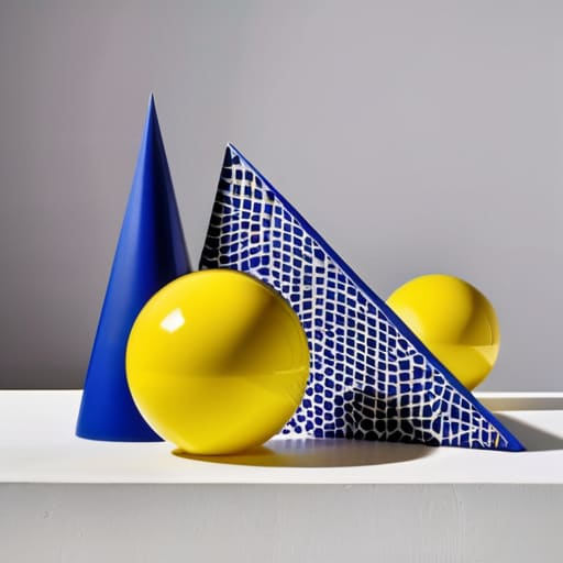
When we look back at the Memphis era, it is easy to dismiss it as mere decorative chaos or a superficial rebellion against the austerity of Modernism. But if you look closer—the way I look at a poorly mixed lime mortar or a misplaced stone course—you see that the color wasn’t just applied; it was used to deconstruct the very idea of stability. By pairing jarring, high-saturation pigments with geometric shapes that seemed to defy gravity, the movement forced us to confront the tension between form and ornament. They didn’t just paint objects; they used color to interrogate the structural logic we had taken for granted for decades.
Ultimately, the legacy of postmodern color isn’t found in a specific shade of teal or a certain pattern of laminate, but in the permission it gave us to be loud. It taught us that a building or an object doesn’t have to be a silent, monochromatic servant to function. There is a profound, human truth in that kind of visual friction. Even as a conservationist, I find myself drawn to that spirit—the realization that architecture is a living dialogue, and sometimes, that dialogue needs to be a shout rather than a whisper.