
I remember sitting in a dusty archive in Ravenna three years ago, staring at a sixteenth-century folio that had been rebound so poorly the spine was practically screaming. Most scholars will spend hours lecturing you on the “intellectual democratization” brought about by architectural treatises and printing, treating these books like sacred, untouchable relics of high culture. But when you actually hold a volume from that era, you realize it wasn’t just about spreading ideas; it was about the physicality of information. You can see where a mason’s thumb pressed too hard against a woodcut of a Corinthian capital, or how a slight smudge in the ink changed the perceived depth of a stone molding.
I’m not here to give you a dry lecture on the history of the Gutenberg press or the lofty theories of Vitruvian revival. Instead, I want to show you how the shift from hand-drawn manuscripts to mass-produced plates actually changed the way we build. We are going to look at the grit beneath the theory—how the precision (or lack thereof) in early printed engravings dictated the way a stonecutter in a local workshop interpreted a joint. I promise to skip the academic fluff and focus on the tangible link between the printed page and the finished stone.
Table of Contents
Movable Type and the New Geometry of Thought
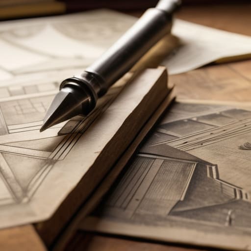
When I stand in a courtyard in Rome or a small villa in the Marches, I often find myself tracing the proportions of a column, trying to see if the stone follows a strict mathematical rule or a local whim. Before the press, those rules were whispers, passed from master to apprentice through hand-copied manuscripts that were often riddled with the errors of a tired scribe. But once movable type entered the fray, something fundamental shifted in the way a builder understood space. The impact of movable type on design wasn’t just about speed; it was about the sudden, terrifying arrival of precision. Suddenly, a specific ratio wasn’t just a suggestion discussed over wine in a workshop; it was a fixed, unchangeable command printed in black ink.
This era forced a certain standardization of architectural theory that we still feel today. I see it in the way certain classical orders began to look eerily similar across different provinces, almost as if the printers had stripped away the regional textures of the stone. While the text provided the logic, it was the woodcut illustrations in architecture that truly bridged the gap between the page and the quarry. A well-executed woodcut could show a mason exactly how a cornice should meet a frieze, translating an abstract concept into a physical instruction. It turned the geometry of thought into a repeatable, almost mechanical reality.
How the Press Forged a Shared Design Language
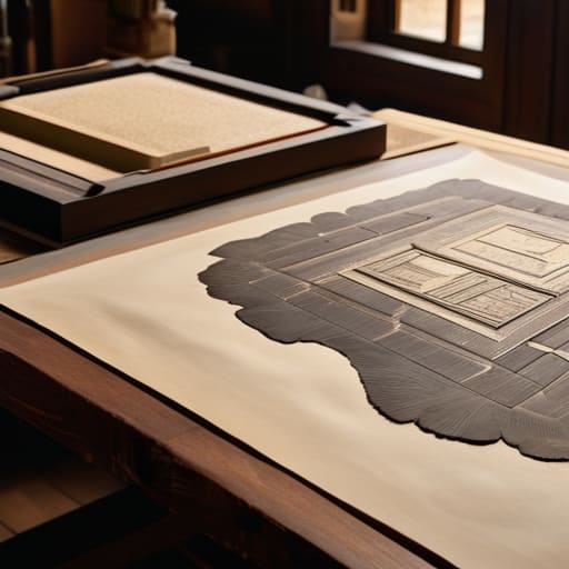
Before the press, a master mason’s knowledge was a local secret, held in the muscle memory of a workshop or the margins of a single, hand-copied manuscript. But with the rise of early modern print culture, that isolation ended. Suddenly, a stonecutter in a small Tuscan village could look at a page and understand the exact proportions of a Corinthian capital used in a Roman courtyard hundreds of miles away. This wasn’t just about spreading ideas; it was about the standardization of architectural theory. We stopped seeing regional variations as mere accidents and began seeing them as deviations from a new, printed norm.
I often find myself tracing the edges of old woodcut illustrations in architecture, looking for that specific tension where the artist’s hand meets the rigid logic of the engraver. There is a profound shift in how we perceive structure when it is translated into these stark, black-and-white lines. You can see it in the way a column’s entasis is rendered; the print demands a certain clarity of intent that a hand-drawn sketch might allow to remain ambiguous. The press didn’t just replicate drawings; it codified a visual grammar that forced every builder to speak the same geometric language, whether they were working in marble or simple brick.
The Ghost in the Print
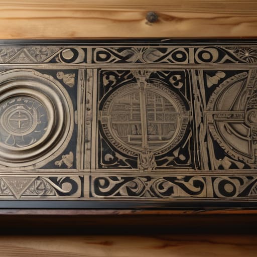
When we look back at this era, it is easy to get lost in the grandeur of the finished cathedrals or the sweeping facades of the Renaissance. But the real revolution wasn’t just in the stone; it was in the way the logic of the joint was standardized through the medium of the page. The printing press took what was once a localized, whispered secret between a master and his apprentice and turned it into a rigid, reproducible geometry. By moving from the singular, hand-drawn manuscript to the mass-produced plate, we didn’t just share images; we codified a way of seeing that ensured a Corinthian capital in Venice would speak the same mathematical language as one in Rome.
As I stand in the dust of a half-restored site, tracing the marks of a mason’s chisel, I am always reminded that these printed treatises are the invisible scaffolding beneath our physical history. They are the silent instructors that live in the margins of our buildings. We must remember that every time we admire a perfectly proportioned arch, we are actually witnessing the triumph of a shared intellectual blueprint that was once locked in ink and paper. To truly understand a building, you have to look past the surface and find the ghost of the architect’s intent, preserved long after the ink has dried and the stone has begun to weather.